Close
Type at least 1 character to search
Back to top

Actionable reporting

In 2023 I was lucky to have an opportunity to work on a project I found very interesting. While challenging, as the problem had multiple layers of complexity, it was also very rewarding in the end as I managed to combine solutions into a unified concept.

For better understanding of the concept, this project was designed for SaaS ecommerce fulfilment and logistics company, Byrd technologies. 

Communication flow
Company as a middleman in communication

Project Origin

This project originally started two years earlier as an effort to increase the usability of the reporting dashboard page in the Customer (merchant) Web App. Previous data analysis proved that the existing Dashboard page, the starting page after login, was used only as a transition. There was a large UI area without interaction because the served content was not meeting user’s needs.

Dashboard page heatmap
Dashboard page interaction heatmap

This was backed up by the following user interviews (11 sessions), during which we gathered information on current use cases and desired functionalities. During these sessions, we were looking to check the viability of the “Action Center”. A central place from which the users could monitor and perform suggested actions.

Key Insights
  1. 81% (9/11) of users use widgets as quick links
    Pending shipments and Quick functions were most used.

  2. 19% (2/11) users skip this page completely
    Their job roles are specialists, focused on certain types of duties.

  3. Action Center
    As proof of the concept, was successful.

  4. Charts over Tables
    Users preferred aggregated data over detailed info.

  5. Timely warnings request
    For soon-to-be expired stock and in which warehouse.

  6. Customizable Period
    ~ 20% of users wanted to be able to adjust the time segment of reporting.

Follow Up

Since it has been over two years since the conducted research, it was reasonable to check the viability of the gathered data before continuing the project. For this, since there was already a good sample of data, I decided to create a survey that would cover a larger audience and possibly discover new moments or gaps in previous research.

Areas of Interest

Survey was structured to clarify 4 key areas of interest.

  1. Qualifying / Placement
    Understanding of the user’s role.
  2. Needs & Priorities
    Giving context on the job at hand.
  3. Difficulties
    Discovering the obstacles.
  4. Suggestions
    Opportunities through open-ended questions.

Tools used for this survey integration were Beamer (for in-app calls to action) and Typeform (for survey forms and data aggregation). The sample size was defined as a duration of two weeks of active running.

Results Analysis

The survey successfully confirmed all the findings from the previously conducted research. However, it also discovered a huge spike in difficulties regarding customer support as 91,3% of users described the slow response as very frequent or extremely prominent.

Problem statement

Defining a solid problem statement required discovering deeper layers of issues. Every statement established was leading to the next “why?”.

  1. Customer satisfaction is very low. …why?
  2. Customer Support team is quite slow in response. … why?
  3. CS team is swarmed with tickets as there is simply too many raised issues … why?

The root problem was not on the surface, but It was obvious that communication could be a main factor. Customers (shop owners) were unhappy with the frequent shipment processing delays by the Warehouses. Since they had no direct communication with the warehouses, all they could do was raising a support ticket. 

The business model of the company would not comply with direct communication channels, but even if it would be the case, it would still not solve the root cause of the problem. 

Going Deeper

The research analysis focused on the following categories:

  1. What are the most frequent types of issues occurring?
    Checking for patterns. (volume)
  2. What are the implications of each type?
    Severity, urgency, priority. (value)
  3. Who is affected?
    Who are the stakeholders?
  4. What’s causing those issues?
    How can we prevent or reduce them?

Key Insights

After the research findings refinement, I was able to detect some repeating patterns and identify user needs as two major types.

1. Notifications

Urgent & Frequent prompts

  • Need for:
    Quick communication and fast response time between user and support.
  • Purpose:
    Shortening stoppage time.
  • KPI:
    Average issue resolution time.
2. Suggestions

Timely announcements

  • Need for:
    Better vision of incoming potential issues with clear CTA.
  • Purpose:
    Preventing future issues.
  • KPI:
    Number of issues over time.

Design Concept

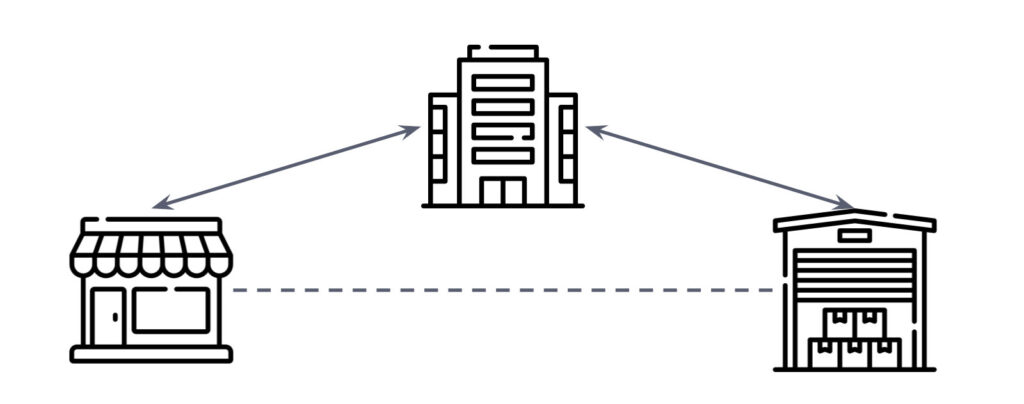
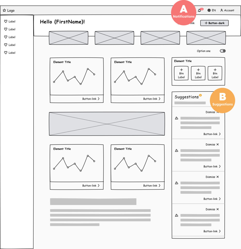
Addressing the needs of two different natures, the design unified two-pronged solutions into one homogenous concept. 

A: Notifications
as urgent and frequent prompts accessible from any page.

B: Suggestions
as timely and persistent helpers intended to prevent future issues.

Dashboard page wireframe

High fidelity designs

Embedded design artboards depict 3 common states of the newly designed dashboard page:

  1. Notifications and Suggestions active
  2. Notifications expanded
  3. Suggestions addressed

For the best viewing experience, you can use the full-screen button in the top-right corner of the preview area.

performance Monitoring

The last phase in this design project is monitoring the performance of implemented design solutions. As stated above, each solution category has different KPIs.

Notifications KPI

Performance tracking:
Average issue resolution time.

Suggestions KPI

Performance tracking:
Number of issues over time.

Results

Since the implementation of the notifications system, the average resolution time for raised tickets was initially reduced by 21%. After supporting functionality in the Android app, this KPI was further improved ending with over 25% of the reduced time needed to resolve the issue.

At the time of writing this case study, the feature of timely suggestions was still not implemented.